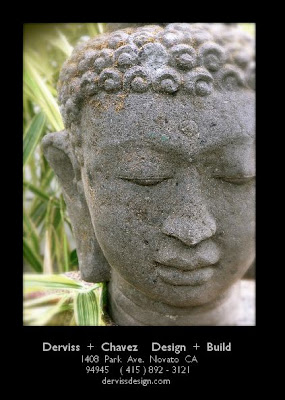
It has a 3/8th border of black around the top and sides and an inch of black with our business name and address on the bottom.
On the back side it will list the collaborators and the artisans that we are working with on the show.

Is that a pistil in your calyx or are you just happy to see me ?


13 comments:
Nice and simple! no confusing things going on or off into lots of odd directions. The white text will draw peoples attention into it right away.
Thanks Garrett,
A good solid critique is an extremely good tool.
Thanks for giving freely of your thoughts.
much appreciated.
Any one else care to express their artist opinion ?
good, bad, not so hot , stinky??? ... all is appreciated and will be taken under consideration.
My mantra : strength is in numbers.
Michelle.
It's exactly what it should be: a poster in miniature...with a nice strong graphic, not easy to do on a small scale. But you've done it! Congratulations.
I think the choice of sculpture instead of a garden image is a wise one. It says what your garden will be--rest and reflect.
As for the black border it ties in with all of your other graphics.
Modern Postcard? They've done my show postcards for a few years.
thanks for your feedback .
Yes Susan, I'm working with Modern Postcard.
Very affordable and the quality has always been high.
They did my last postcard, the one with the mosaic path detail that Lee Anne White took for Fine Gardening Magazine.
I'm getting 2000 printed up ... .. but also just put an email into the show's marketing director for her feedback.
I'm hoping she will say that 2000 is a good number.
It is about $ 260 for 2000 and about $ 340 (approx. I can't remember exactly ) for 3000 post cards
I think 2000 will be fine. We used about 1000 for 20,000+ last year in the NJ show. Also Modern Postcard.
Now you've got me thinking I should do a postcard for the show house I'm doing in May. Maybe I should blog it and we can go back and forth...
Susan,
Do you have a blog ?
If you do I would love to read it to see what you are up to, especially to see how things shape up for the showcase house.
I would probably have a small amount of post cards printed up if I was doing a showcase house.
The nice thing about them is that they evoke a 'real life' environment rather than a faux gardenesque stage set like the interior show gardens do.
Is there a 'theme' for the showcase house this year ?
How many people are expected to go through it ?
I think that it is great that you are keeping your professional identity/ brand/ company in the public spot light.
It does make a difference to have name recognition.
best,
michelle
I have a blog space but nothing in it. I'll post the showhouse plan today so you can see what I'm doing. I've loved reading your show prep.
I think it is an excellent photograph for a postcard and your theme of the spa/meditation garden. The face reflects the theme. Is this the Buddha head that will be in the glass mosiac wall fountain above the tub?
rub a dub dub, that's the buddha head above the tub.
Poor old buddha, I dropped him yesterday.
Fortunately no major damage, just a few scrapes and a broken curly cue off of his coiffed head.
I was setting him up on a table so that I could level him with my stone cutting saw and he decided to check out the pavement .
Rolly poley Buddha head , ... almost crushed my toes off ! He weighs about 60 pounds , talk about being a hard head ! - cha !
60lbs! That's a big head. Thank goodness he didn't break. You might have had to make a mad dash to Bali to replace him.
Here you go. I finally posted something. Having some techincal difficulties with images and captions. With anything, there's a learning curve.
I love me a buddha-man. Cool card
Post a Comment